 DESIGN EVALUATION WORKSHEET
Aaron and Clarice
Page
Thumbnail
|
Picture
|
Name of Designer
|
Detailed Description
of the Design
|
Explanation of Why
You Liked This Design
|
Page 57
Thumbnail
21
|
|
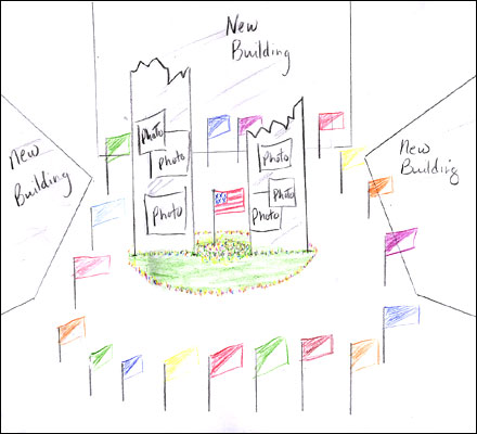
Mary Murphy
|
The design has many flags. Three
new buildings and two large walls of
glass. The design is creative, nice,
beautiful, and colorful.
|
We like
the design because in the center there
are two large walls of glass that a
broken on top. this reminds us of the
Twin Towers that are now gone. There are
colorful flags around the buildings.
Also, three new buildings surround the
walls of glass. A large flag of America
is placed between the walls. Flowers
surround the two large walls of glass. |
Teacher
Evaluation: Aaron and Clarice
| Grade 3 The students' insight relating
the broken walls of glass to the broken
Twin Towers is excellent. The remainder
of the students' explanation seemed more
like a description of the design and not
enough of an evaluation of it. The
students should have explained the
symbolism of the colorful flags and
flowers that surround the walls of glass
or explained what it is about these
elements that they leads them to choose
this design.
|
Grace and Nicholas
Page
Thumbnail
|
Picture
|
Name of Designer
|
Detailed Description
of the Design
|
Explanation of Why
You Liked This Design
|
Page 51
Thumbnail
12
|
|
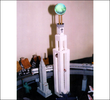
Stuart David Smith
|
The design has a crystal globe
that rotates on the top of the tower
meaning the regions all around the world
have universal hope and will stand
strong. The towers are 120 stories high
to show the United States will stand tall
and strong. Each of the four towers are
joined by a common bridge at the top.
There are global elevators that would
plan the outer walls between the two
buildings. the elevator will lead to a
revolving restaurant.
|
We like
the design because it means something.
These buildings represent America. We are
strong, brave and tall. We will stand
united. The crystal globe stands for
people all around the world who will be
united against terrorism. |
Teacher
Evaluation: Aaron and Clarice
| Grade
4 The students were able to
describe the design in great detail
making it easy for others reading their
descriptions to envision the designer's
concept for the structures. The students
related the elements of the design that
they described to their symbolic
significance.
|
Lisa
Page
Thumbnail
|
Picture
|
Name of Designer
|
Detailed Description
of the Design
|
Explanation of Why
You Liked This Design
|
Page 67
Thumbnail
19
|
|
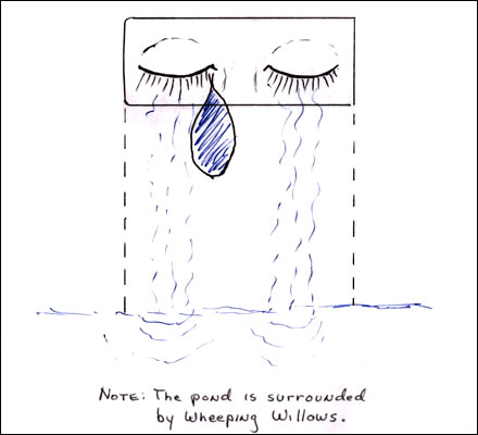
Linda S. Hart
|
This World Trade Center design
is a four sided hollow building that is
in a pond that is surrounded by weeping
willlows. The top part has a fountain
that looks like crying eyes. The tear
drop has different colors. It is the
memorial of the people who cried as a
result of the Sseptember 11 events.
|
I like
the design because the weeping willows
look like real tears. I like the idea
that the different colors in the tear
drop stand for the different people who
live in America. I also like the crystal
base in the reflection of the pond. This
represents that our freedom is as fragile
as crystal. |
Teacher
Evaluation: Lisa
| Grade 4 The students clearly and vividly
described the design making it easy for
others reading the description to
envision the designer's concept for the
structures. The students related the
elements of the design their symbolic
significance.
|
Nathan and Ann Marie
Page
Thumbnail
|
Picture
|
Name of Designer
|
Detailed Description
of the Design
|
Explanation of Why
You Liked This Design
|
Page 50
Thumbnail
8
|
|
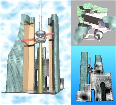
Gintas Narkevicius
|
This design incorporates the
look of the original Twin Towers but adds
to it. The third building looks like it
is built around the Twin Towers as if it
were tying to defend them. The area where
the Twin Towers once stood is filled with
water so nobody can walk on the sacred
ground. Around the space where the towers
stood are two walk ways at the two
different elevations that the planes
crashed.
|
We like
this design because it really looks
futuristic. We like the fact the outer
building prevents the towers from being
torn down. We especially like the idea
that the footprint area would be filled
with water to keep the area as a
remembrance of the original towers and
of all the people who lost their lives
there. |
Teacher
Evaluation: Nathan and Ann Marie
| Grade 4 The students clearly describe the design so
that we can envision the design. The students relate the
design elements to the events of 9/11 and describe how
the design memorializes the heroes and victims of 9/11.
The students highlight the design structure that will
serve as protection for the inner structure which
represents the original twin towers.
|
Erden and Jessica
Page
Thumbnail
|
Picture
|
Name of Designer
|
Detailed Description
of the Design
|
Explanation of Why
You Liked This Design
|
Page 49
Thumbnail
1
|
|
Paul I. Pettys
|
Each footprint of World Trade
Center tower one and tower two would be
raised hollow ground. It would be covered
with grass. There would be a granite
prayer wall on it. There would be two
open stairway towers that have 2,823
steps representing each of the people who
lost their lives. There would be an
arched twenty story mirrored cultural
building that would reflect the step
towers and green tower footprints.
|
We like
this design because the prayer wall would
allow family members of those who died to
have a place to remember and pray for the
people they lost. We like that the step
tower will be mirrored by the cultural
building. It will look like there are two
step towers. |
Teacher
Evaluation: Erden and Jessica
| Grade 3 The students clearly described the design and
related how the prayer wall in the design will
memorialize the victims and heroes of 9/11. More
reference to the steps serving to represent those who
lost their lives might have been mentioned.
|
|