 |

Aim:
1) Using your printed out table of economic and social indicators and your glossary fill in the gaps below. This should help you to decide later on which of your countries are LEDC’s and which are MEDC’s and understand why you made that decision.
2) Using Excel to plot graphs of GNP against 1 or 2 social indicators and explain the results.
The country with the highest GNP/person/ year is ________; the country with the lowest is ____________. GNP is an ________ indicator, it shows us the _________________________. Usually the higher the GNP the more ____________ the country.
The country with the highest birth rate is ________________, the country with the lowest birth rate is ___________. The birth rate is a ___________ indicator and tells us the _________________. Countries with _____ birth rates are usually LEDC’s this is because of a number of reasons such as: people tend to have a lot of children if they think they will not all survive till adult hood or ( can you think of another one?) MEDC’s tend to have ___ birth rates, this is because of good access to family planning clinics and contraception.
The country with the highest death rate is __________; the country with the lowest death rate is _________. The death rate is a __________ indicator and tells us the _____________________. Countries with high death rates are usually ________ because ______________________. Countries with low death rates are usually _________ because_________________.
The country with the highest life expectancy is ________________; the country with the lowest life expectancy is __________. Life expectancy is a __________ indicator and it tells us the ___________________. Countries with high life expectancies are usually _________ because______________________. Countries with low life expectancies are usually __________, because ____________________.
Using the framework above, write paragraphs for the last 4 indicators in your table.
Ø Now looking at your table and statements decide whether each of your countries is and MEDC or LEDC. Once you’ve come to your decision type in either MEDC or LEDC into the final column. Ask you teacher to check if you have made the correct choice.
Ø Finally print a copy of your completed table and your writing on development indicators and stick it in your book.
Looking for correlations.

You are now going to look for correlations between the GNP (wealth of a country) and two different social indicators of your choice. To do this you are going to plot a scattergraph using Excel.
Follow these steps carefully. Transferring the information into Excel:
1) Open your table in word and the spreadsheet program EXCEL
2) You should get a grid, with letters and numbers along the edges, a combination of a letter and a number tells you the location of the square.
3) On your table, highlight the whole Country and GNP column by holding down the left mouse button and dragging the mouse over the selected area. Now click the right mouse button on this highlighted area. Select copy.
4) Return to your excel spreadsheet, right click in Cell A1. Select paste and your two columns should appear.
5) Now go back to your table choose 1 social indicator (preferably one without gaps) you would like to compare with the GNP, and copy and paste this into the third column on your spread sheet following the above instructions.
You are now going to plot a scattergraph:
1) Select cells B2-B11 and C2-C11 (not B1 or C1)
2) Click on the graphing tool (a bar graph symbol on the middle tool bar)
3) Now select your graph type: XY scattergraph
4) Now select the top option (with no lines) in the chart sub type section.
5) Click on Next to see what it looks like (make sure GNP is on the x axis (horizontal) and the other indicator on the Y axis)
6) Click Next: Now give your graph a usable title and label the axis (remember to put units)
7) Click Next: select as a new sheet
8) Click: finish – Your graph should now be completed –if it has come out incorrectly follow steps 1-8 again carefully.
You now need to decide whether your graph has a positive or a negative correlation or no correlation at all:
 |
 |
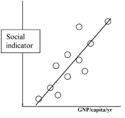
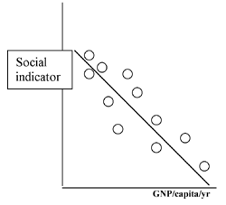
| This is a positive correlation. You can see there is a general trend: as GNP increases so does the social indicator. It is possible to draw a best fit line as I have done | This is a negative correlation. You can see there is a general trend: as GNP increases the social indicator decreases. It is possible to draw a best fit line. |
 |
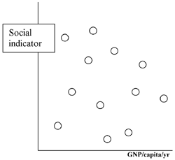
| Here there is no correlation. The points seem to be randomly scattered and it is not possible to draw a best fit line. |
Once you have decided add a best fit line. To do this:
1) Right click on one of the points on your graph.
2) Select Trend line from the menu
3) Under Type choose Linear – click on okay
Now describe your results in a paragraph under your graph. Make sure you include whether there is a correlation and what the graph shows. Eg: As GNP increases the………………………... This is because………….
If you have finished this and you have time: plot another indicator, add the best fit line, decide if there is a correlation and then describe your graph.
Now print your graph(s) and write up. Stick these into your books.