 Unit:
Immigration
Unit:
Immigration
Lesson 2: What Countries Do We Come From?
Unit:
Immigration
 Carolyn Hornik
|
Aim:
1. To locate countries
on a world map.
2. To develop an
appreciation of ethnic diversities.
3. To create a spreadsheet.
4. To create a graph
from a spreadsheet.
5. To create graphs
using a drawing and painting application.
6. To read and interpret
bar, line, circle, and pictographs.
Standards Addressed:
1. collecting and organizing data to
answer a question or test a hypothesis by comparing sets of data
2. displaying data in line plots, graphs,
tables, and charts.
3. making statements and draws simple
conclusions based on data.
4. gathering data about an entire group
or by sampling group members to understand the concept of a sample.
5. becoming aware
of reasons for and effects of migration and immigration of different peoples
to the United States in general and the New York City
region specifically
6. developing
awareness of the the democratic ideals upon which this nation was founded,
as well as the struggle on the part of diverse groups to achieve these
ideals over time
7. recognizing
important political, economic, and social developments in history of New
York City and the United States and their impact on diverse groups of
Americans
8. recognizing
the impact of people of divers cultures on New York City and the United
States over time
Vocabulary:
ancestors country
of origin route
spreadsheet bar graph
pictograph line graph
circle graph
tally cell
format
font
style
Materials:
If Your Name Was Changed At Ellis Island CD, KidPix,
ClarisWorks, world map, string
Time Frame:
4 forty-five minute periods
Motivations:
1. Students review
introduction to book If Your Name Was Changed At Ellis Island,
by Ellen Levine, published by Scholastic
Inc., New York, 1993 on the CD. Have students highlight the
paragraphs that tell the names of different countries people immigrated
from using the stamp tool. Locate these countries on a world map.
2. Elicit from students
the names of the countries that their ancestors are from. Locate these
countries on the world map. Use colored string to trace a route from the
country of origin to The United States.
Procedure:
1. List names of countries that children's
ancestors are from on chalkboard.
2. Use tallies to mark the number of
children in the class from the different countries listed on the board.
3. Total the tallies.
4. Using and LCD projector demonstrate
how to create a spreadsheet on ClarisWorks as the children create one at
their workstations. (Format font, style, color. Create headings for each
row with the names of each country. Enter the number of children from each
country in the appropriate cells.) See spreadsheet below.
| Haiti | China | Ireland | Russia | Poland | Ecuador | Italy | Israel | Puerto Rico | Viet Nam |
|
|
|
|
|
|
|
|
|
|
|
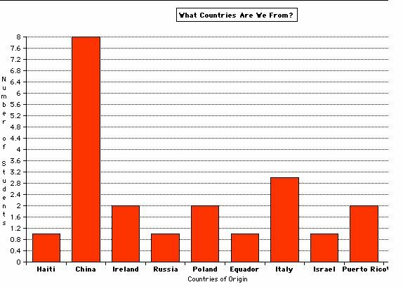
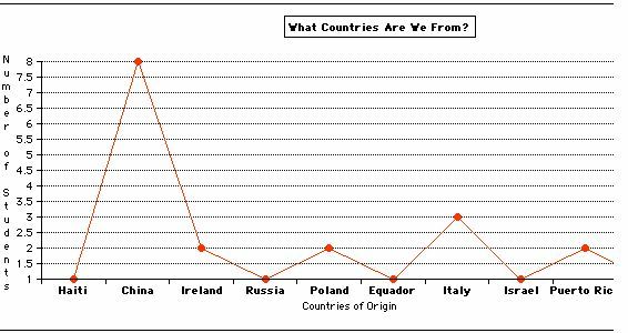
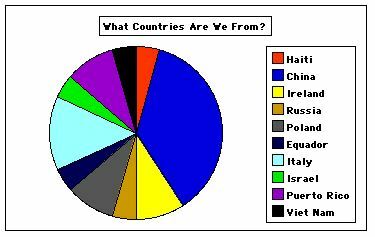
5. Highlight the cells on the spreadsheet
and choose OPTIONS from the menu bar. Create a bar graph, line graph, and
circle graph with the information in the spreadsheet as shown below.
 |
 |
 |
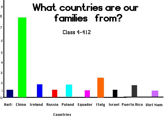
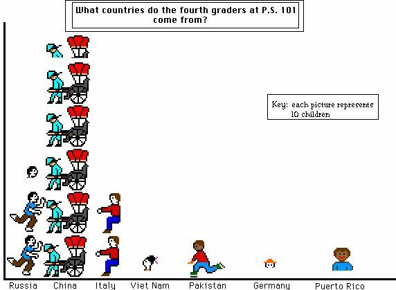
6. Students use Kidpix to create
a bar graph, line graph, and pictograph.
 |
Evaluation: Students will
be evaluated on their ability to create a spreadsheet and construct and
interpret the bar, line, circle, and pictographs. The following focus questions
may be asked:
1. From which country do most of the
students' ancestors in this class come?
2. What is the range of the data shown
on the graphs?
3. How many students were surveyed?
4. Which graph do you find easiest
to interpret? Explain why.
5. Which type of graph is most difficult
to interpret? Explain why.
6. Why is a bar graph created from
a spreadsheet more accurate than one created on a drawing and painting
program like Kidpix?
Note: Some students may have
difficulties in finding out the country of origin of their ancestors. If
this is the case, use the data from the other students in the class to
create the graphs.
Lesson 3: Why did people leave
their homelands to immigrate to the United States? ![]()